Charts
View outcome market probability charts from Telegram.
Charts help you see which outcomes are moving before you trade.
Open a market and tap Chart.
Reading The Chart
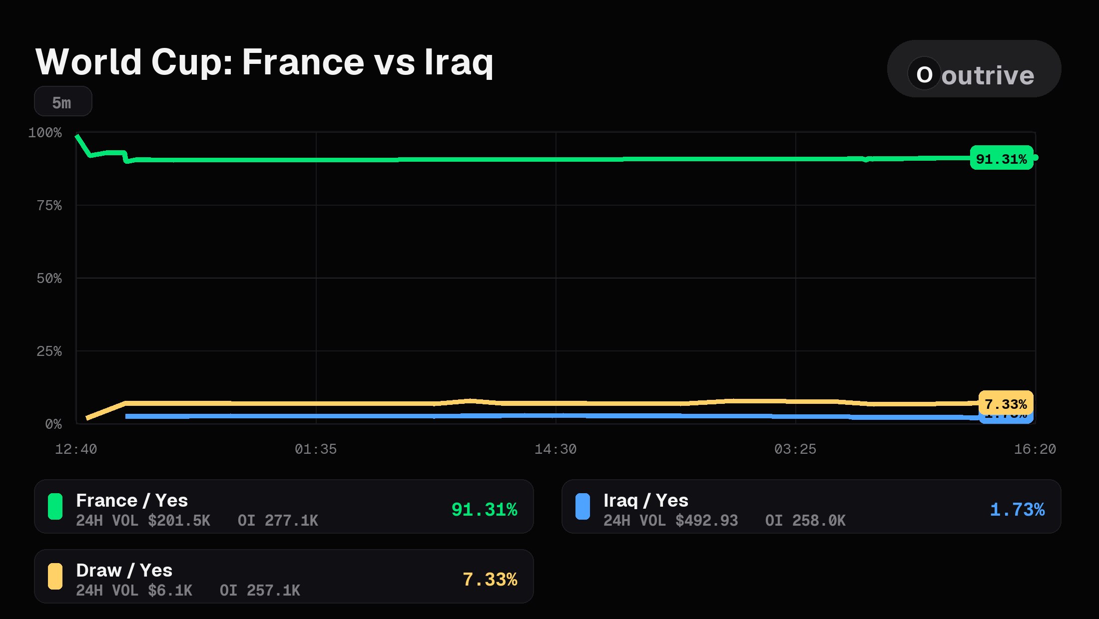
Each line tracks one YES outcome in the market.
Use the chart to compare momentum between the most active outcomes. A rising line means that outcome is becoming more expensive. A falling line means it is becoming cheaper.
The legend shows the outcome name, recent activity, and the latest price.
When To Use It
Use charts when:
- You want to compare the strongest outcomes quickly
- You want to see if price is moving before entering
- You are choosing between similar outcomes in the same market
Refresh
Tap Refresh Chart for the latest view.
Next: Trading